Rebuilding Milingual's member center, checkout, and back office
App Design
Project
Timeline
What I did
Team
Overview
I redesigned the member center, checkout, and product-setup back office for Milingual, a phonics education brand in Taiwan. The goal was to make order and course status clear for parents and easier to manage for the staff behind them.
Who is the product for?
The platform serves two groups with very different needs:

- Self-serve order and course status
- Fewer reasons to contact customer support

- Less manual, repetitive work
- Product setup that's hard to get wrong
RESEARCH
Understanding the current situation
Before designing anything, our team audited how the current site actually gets used. Over two weeks, we interviewed 9 staff members across 13 workflow areas — customer service, warehouse, finance, course scheduling, content, and a branch office — and mapped every back-office menu they touched.

"Only the warehouse knows where a package is. There's no carrier tracking." — Customer service

"Members can't look up which coupons they have or when they expire. They ask us, and they often forget to use them in time." — Order admin
Learning and Insights

Visibility
- Order status only existed in the warehouse. No carrier tracking, and no status a member could read.
- Payment status and fulfillment status were blurred into one field, so course-only orders looked permanently stuck.
- Members couldn't see which coupons or points they held, or when they expired, so they asked support and often let them lapse.

Manual Workarounds
- An abandoned checkout locked the coupon code as "used." Support had to void the dead order by hand to release it.
- "Hold shipment" couldn't be undone, and the order list didn't show product type, so the warehouse guessed from the amount and opened orders one by one.
- Orders mixing materials, video access, and a physical class couldn't share one payment link, so staff built links manually and parents paid twice.

Account Structure
- The buyer and the learner are rarely the same person. Parents pay, kids learn.
- Siblings shared one parent account, and the system gave both children the same seat number.
- Course access, materials, and video lessons all lived under one login with no way to tell whose was whose.
Conceptualization
Deciding the shape first
THE SOLUTION
Feature Walkthrough
Learning and Insights
Coach Feedback
Insight: Clinicians skipped or ignored the feedback blurb mid-conversation, treating it as a interruption rather than a resource.
Action: Explore call-to-actions to reframe feedback as forward-looking coaching rather than evaluation. Try adding a timed session before user can skip.
PHASE & PROGRESS INDICATION
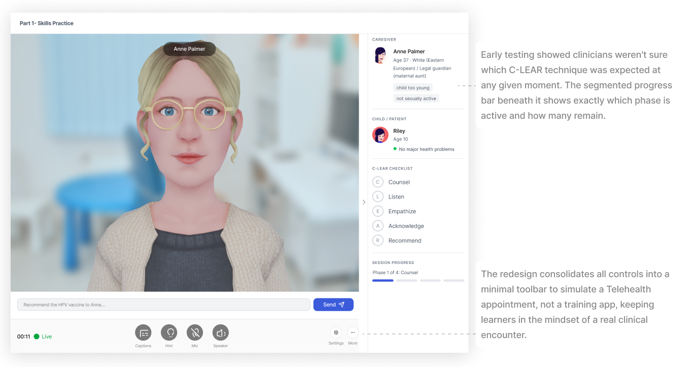
Insight: Users felt disoriented across session phases, unsure which C-LEAR technique was currently expected and how far along they were in the session.
Action: Need to highlight the current phase and add progress indicator.
INTERACTIONS
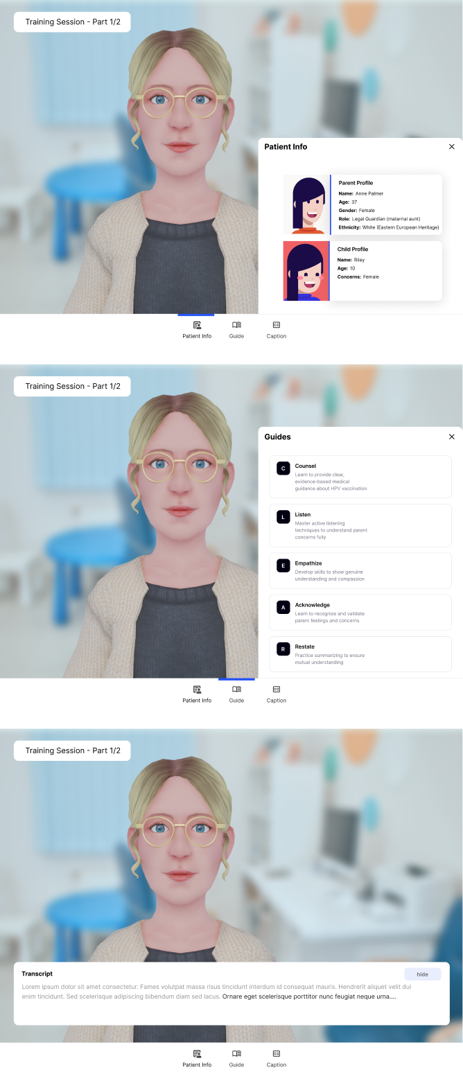
Insight: Clinicians wanted to stay immersed in the patient conversation. Secondary controls and context panels created visual noise that broke simulation realism.
Action: Move session controls to a minimal bottom bar modeled on video call conventions, making the interface feel like a real telehealth session. Patient background and C-LEAR reference can be moved either into a side panel or a dropdown.
Product Walkthrough
The Pilot
AI Training
IMPACT
Current Phase

Next Steps
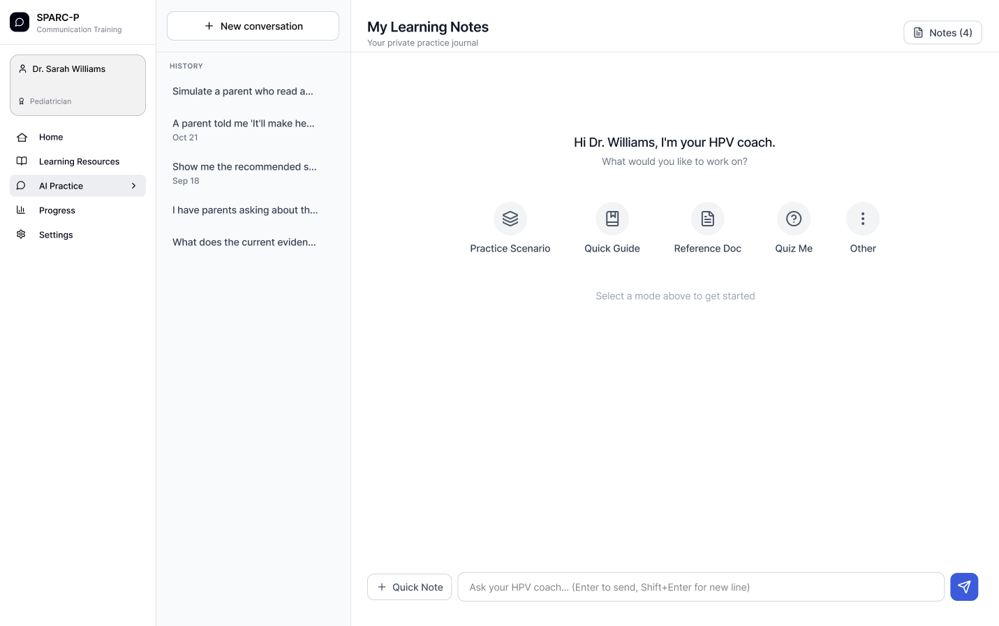
The current simulation trains clinicians through structured roleplay. The next phase introduces a conversational AI coach that clinicians can talk to before entering a formal training session: ask questions, rehearse specific phrases, explore edge cases, or simply think out loud about a difficult parent scenario they encountered that week.
The proposed chat interface can make invisible process interactive and scaffolded. The design question this opens up is how AI should behave as a professional learning partner rather than a task executor. In the context of clinical training, that means the coach shouldn't just answer questions — it should model the reasoning behind good communication, surface relevant C-LEAR principles without being prescriptive, and know when to push back versus when to affirm. This positions SPARC-P as a research opportunity at the intersection of human-AI interaction and professional learning: how do we design AI interlocutors that support expert skill development, not just novice onboarding?