From Scattered Tools to Smart Workflows:
Designing Turbo's AI-Powered Sales Platform
App Design
Project
Timeline
What I did
Team
Ellen B | UI/UX Designer
Ben A | AI Engineer
Zhiyi | Front-end Developer
Overview
Flow AI is a company that is dedicated to develop tools that maximize sales reps' daily activity. Turbo is their lead source tool that use AI to present qualified accounts and streamline the customer acquisition process.
But what exactly does Turbo offer?
AI-Powered Lead Discovery- Tell Turbo who you're looking for, and AI generates a qualified list of accounts that match your ideal customer profile—no more hours spent filtering through thousands of irrelevant results.
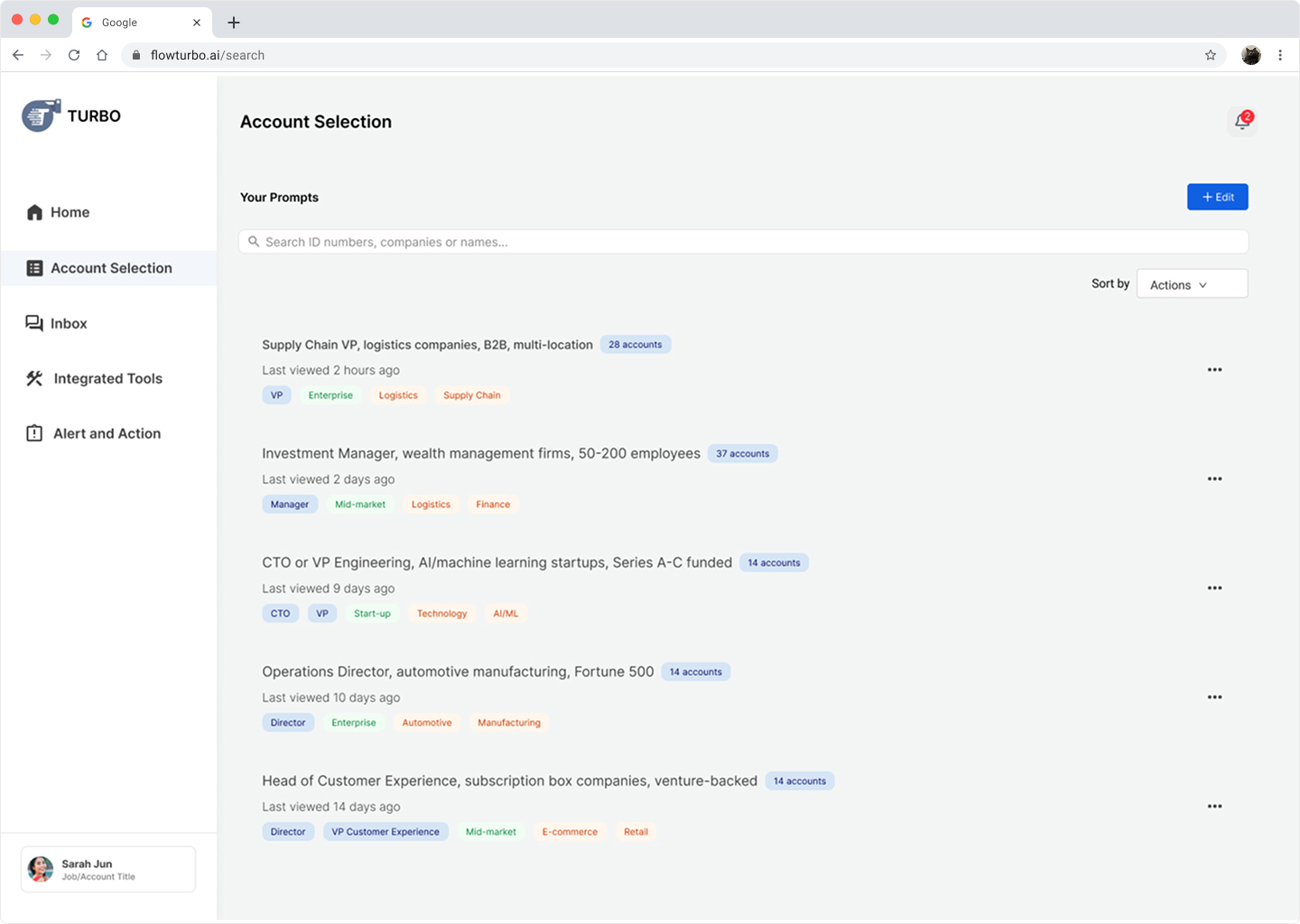
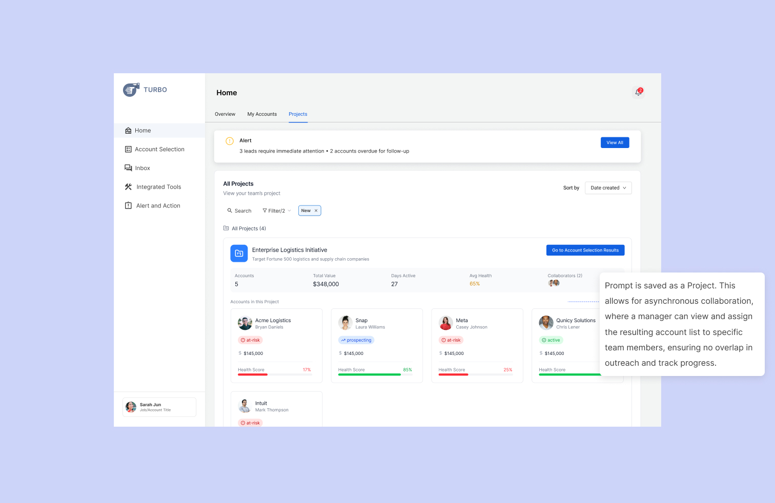
Saved Prompts & Projects- Save your best searches as reusable templates and share them with your team, ensuring everyone targets the same high-quality accounts without rebuilding criteria from scratch.
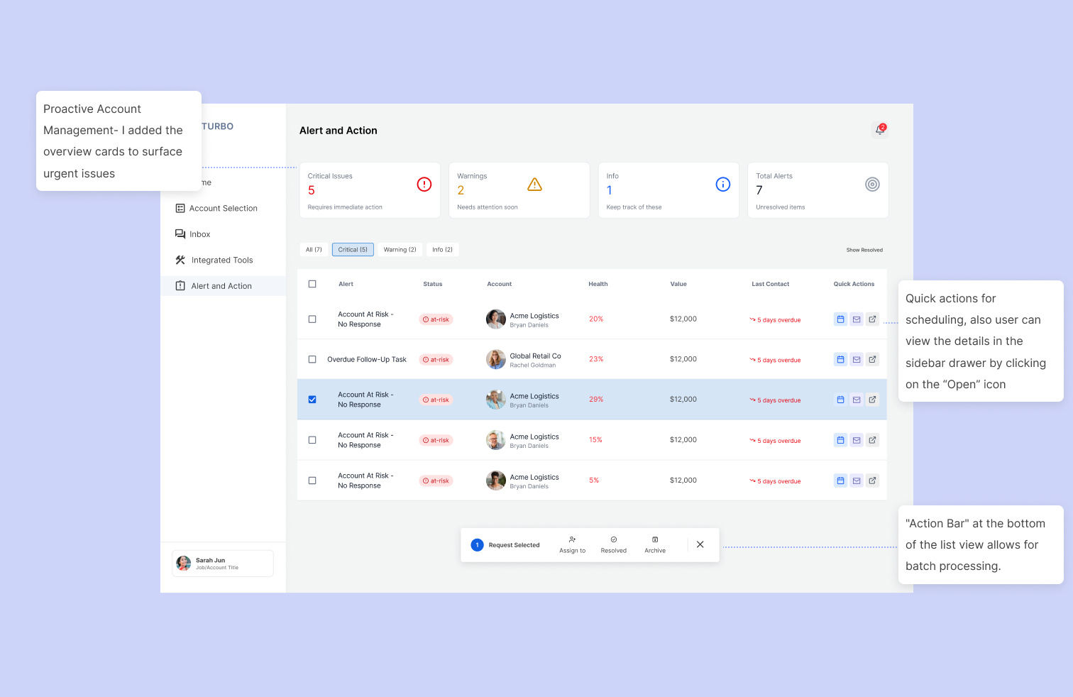
Saved Smart Prioritization with Alert & Action- Know exactly which accounts need attention today with AI-powered alerts that flag critical issues, at-risk deals, and overdue follow-ups—so nothing falls through the cracks.
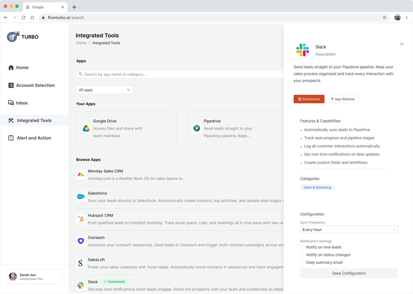
Seamless Tool Integration- Connect your existing sales stack (Salesforce, HubSpot, Slack) so data flows automatically between tools, eliminating redundant data entry and keeping your team in sync.
background and Problem
Sales reps struggle with information overload and fragmented tools across the entire sales cycle
Sales reps spend hours:
- Manually updating lead statuses in CRM
- Context-switching between email, Linkedin, Slack...etc
- Trying to remember which account to follow-up
- Re-briefing team members because notes are scattered
Understanding the Complex Problem Space
What’s wasting their time?
This was quite a challenge for me since I have no prior knowledge to the sales industry. I decided to do a competitor analysis to understand the sale stack tools and the customer acquisition process.
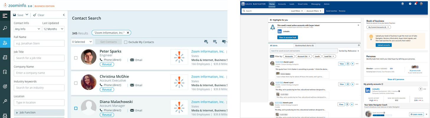
Mapping the Complete Sales Journey
.jpg)
Here's what a typical Tuesday looked like for sales managers:
9:00 AM: Open Salesforce to see 73 "open opportunities"
9:15 AM: Switch to personal Excel tracker titled "Hot Deals I Actually Care About" because CRM doesn't show what matters
9:30 AM: Post in Slack: "Has anyone talked to Acme Corp?"
9:45 AM: Search Gmail for "proposal" to find sent proposals
10:00 AM: Check LinkedIn to see which prospects viewed profile
10:30 AM: Finally start actual work

Architectural Exploration
Finding the Right Framework
1. Top Nav Bar- Keeping filters, results, and account details visible simultaneously to minimize context switching.
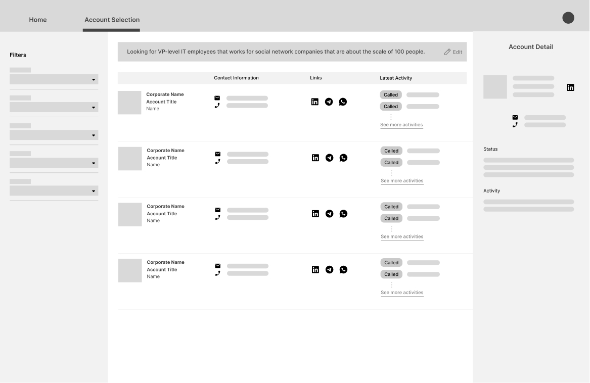
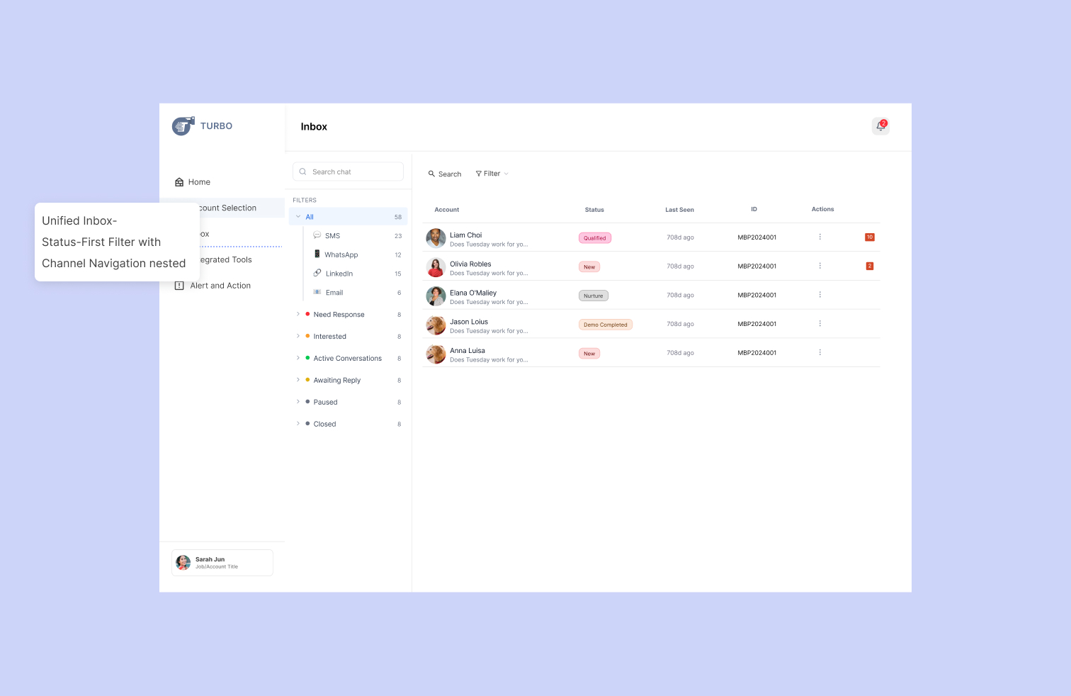
2. Side Nav Bar- Focused approach where filters were tucked away, giving more screen real estate to the account list and the detailed deep-dives. Detail information and actions will be open via drawers or modals.
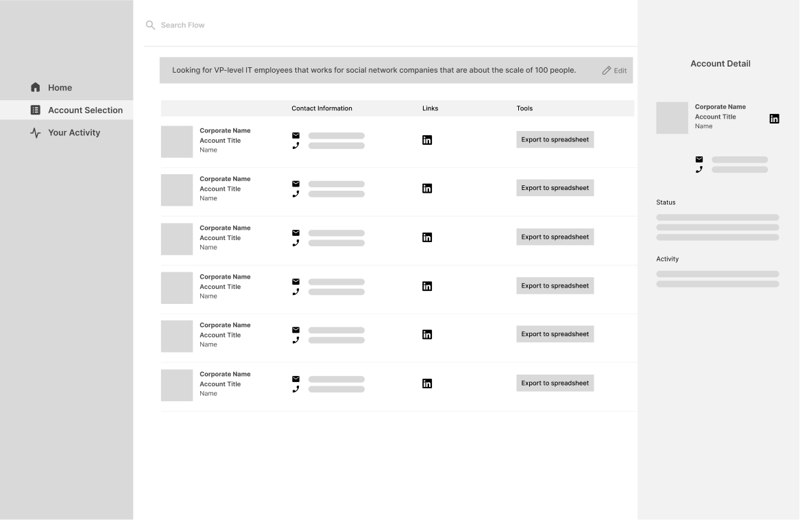
3. Top Nav Bar - Focused on consolidating tools and information on the same view.
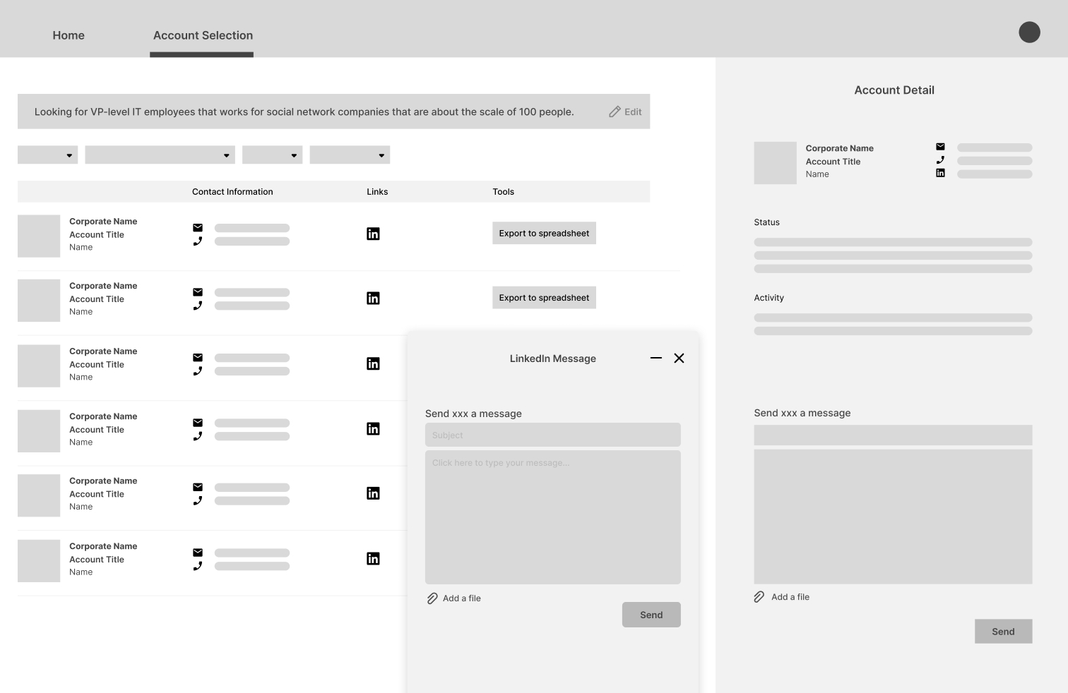
Eventually, we decided to go with the Side Nav Bar considering product expandability and Action-Oriented, and avoid cognitive overload. Drawer also prevents users from feeling lost and frustrated after content-switching.
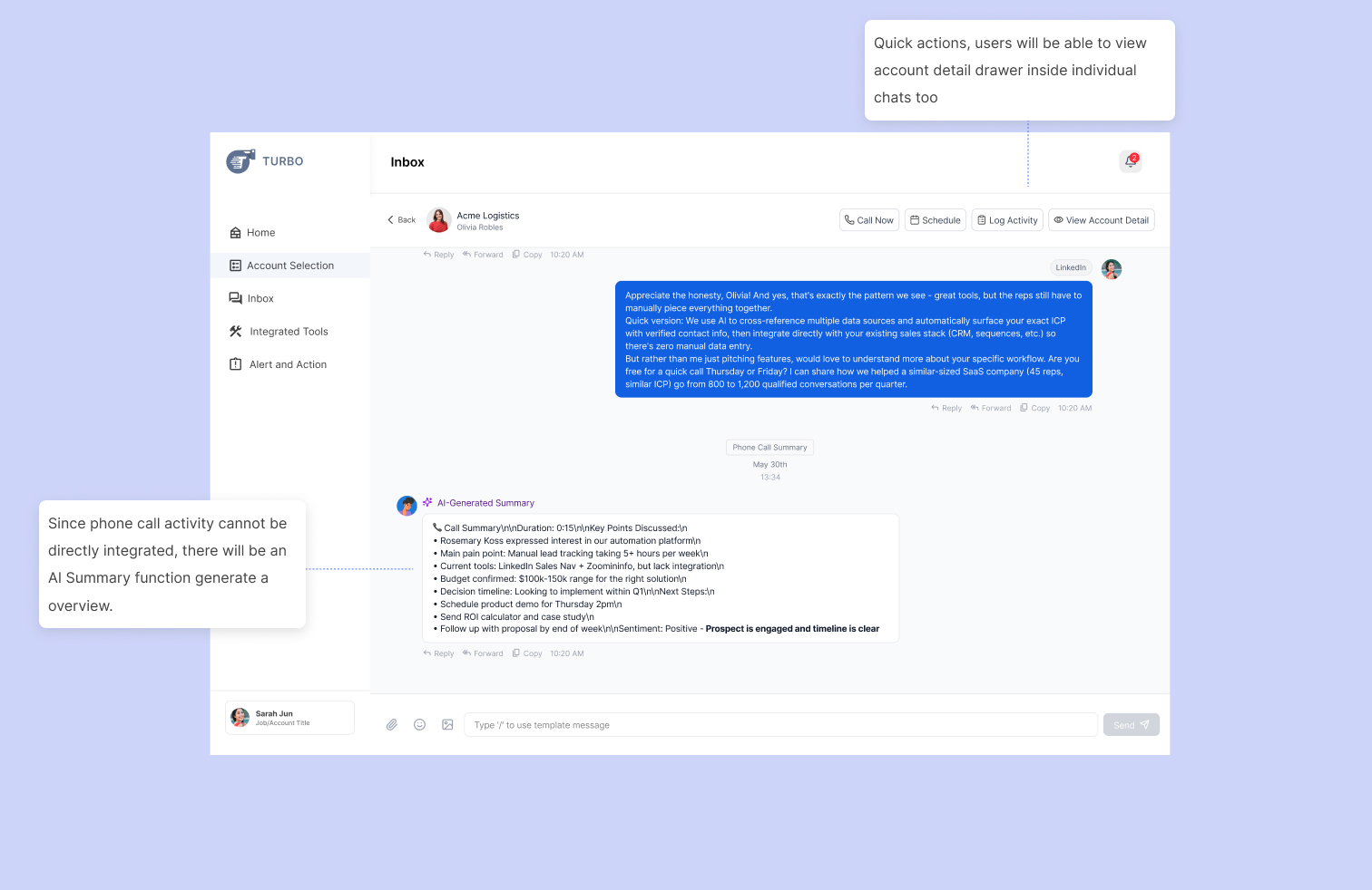
Progressive Disclosure: Only showing the most critical data points (like Health Score and Value) in the list view, while hiding technical details until an account is opened.Action-Oriented Design: Testing where "Quick Action" buttons (Email, Calendar, Chat) should live to ensure the "Time to Action" was as low as possible.Collaborative Context: Ensuring that team mentions and activity logs were integrated into the primary layout so reps wouldn't have to search through Slack or email to find account history.
Iterations
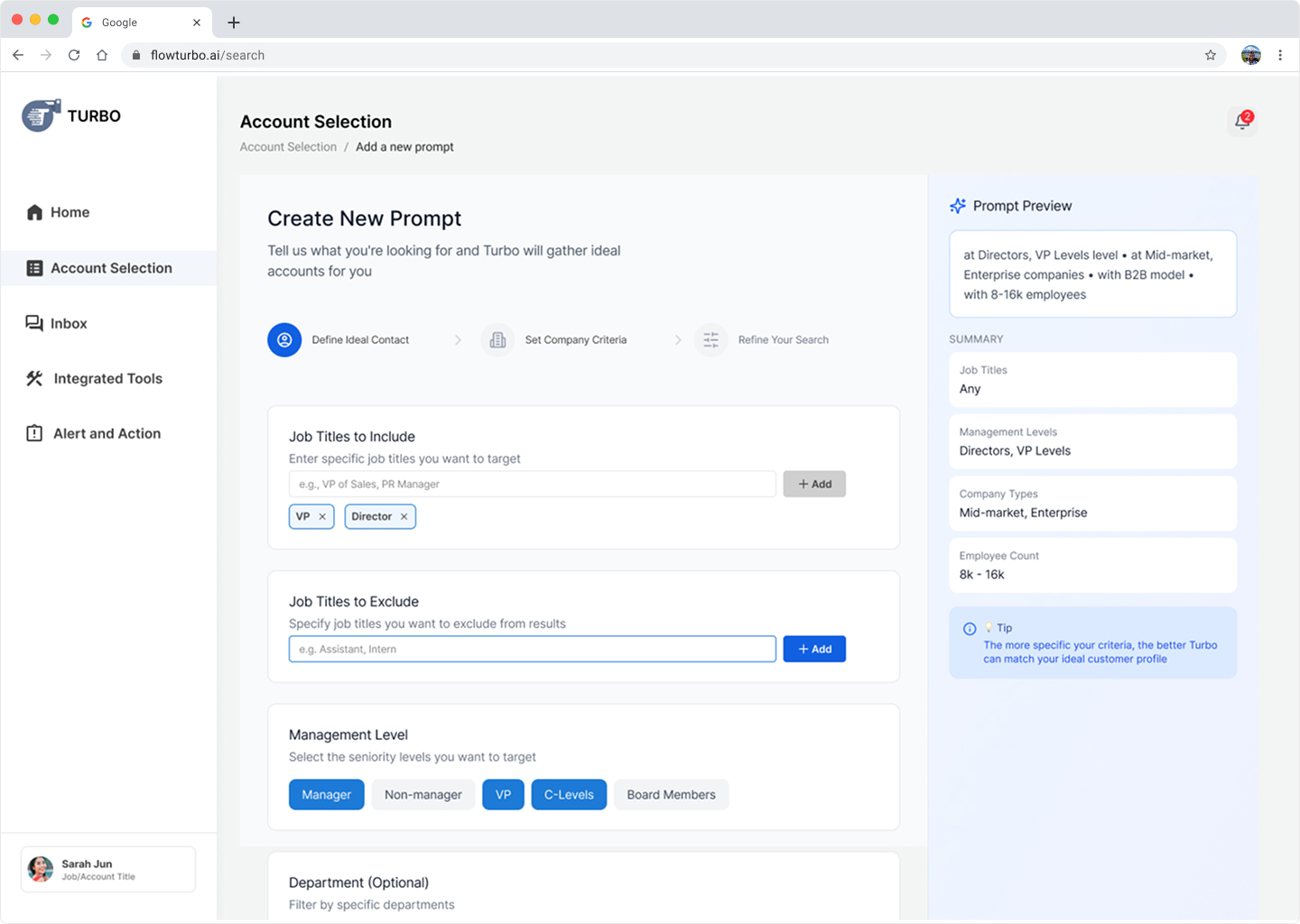
AI Prompt and Score System
Starting with AI Prompt, this is the primary touchpoint of the customer aqusition process. I My goal is to consolidating search criteria into an intelligent, guided workflow. In order to enable sales reps to bypass fragmented databases and move directly into high-intent relationship management.
Idea 1- Blank Canvas
My original thought was to design this like as a conversational AI. I researched on different ways of interacting with a language model, including using a quality meter to suggest improvements and a checklist that updates in real time while inputting.
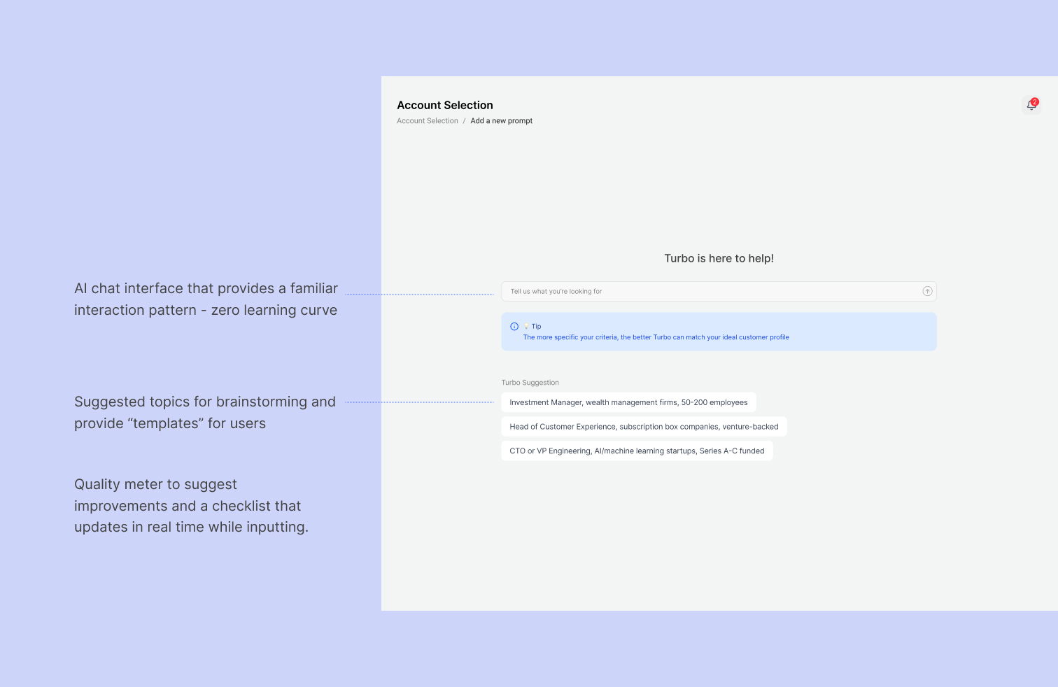
👎 After user testing, it showed that users felt 'blind'—they didn't know what the AI was capable of, leading to vague prompts and low-quality leads.
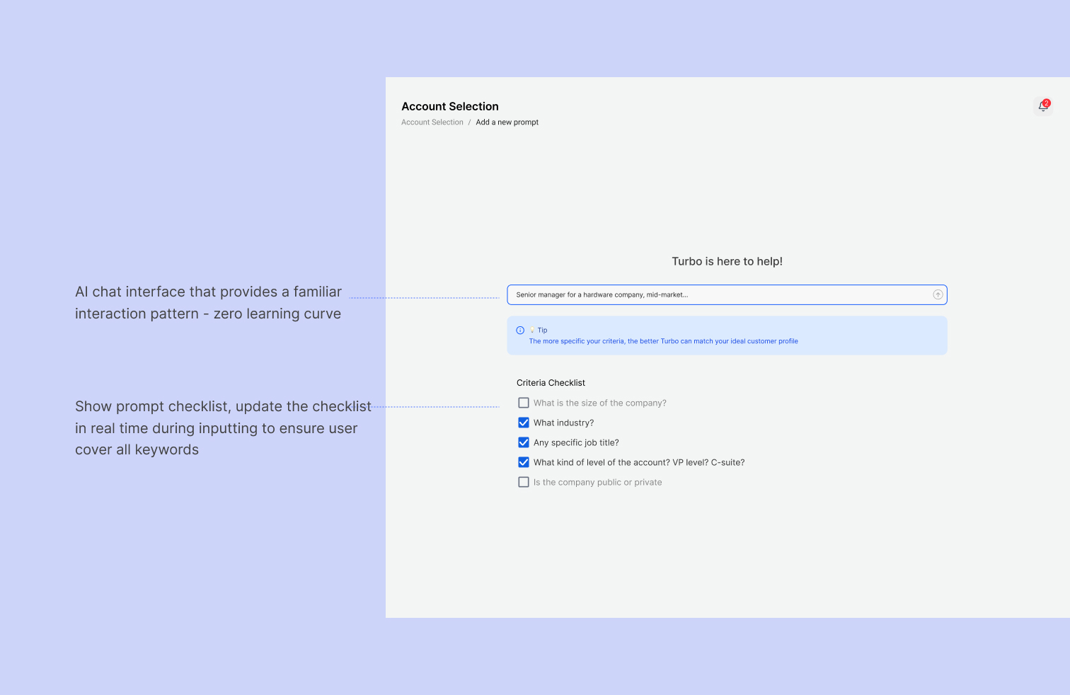
Idea 2- The Traditional Form
Then I quickly realized that people’s conversational style are extremely different. When I ask them to input a sentence for a same type of target, they constructed the sentence very differently, which eventually led to inconsistent results.
And in order for our model to work, user would need to input parameters and descriptors that our model recognizes. I collaborated with our AI engineer to consolidate a list of parameters.
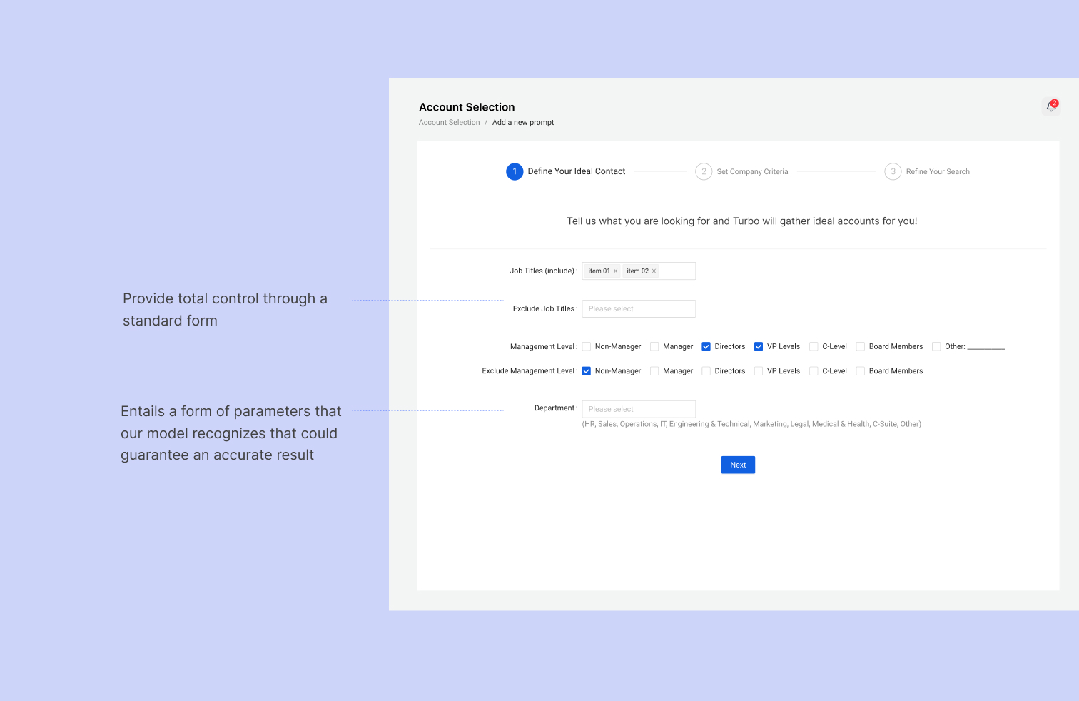
👎 While this solved the clarity issue, it introduced high interaction cost. Users felt they were back to being 'data entry clerks'—the exact pain point we aimed to solve.
Idea 3- The Guided Prompt
A card-based, modular UI that uses "rails" (structured inputs) but visualizes the output in real-time.Then I quickly realized that people’s conversational style are extremely different.
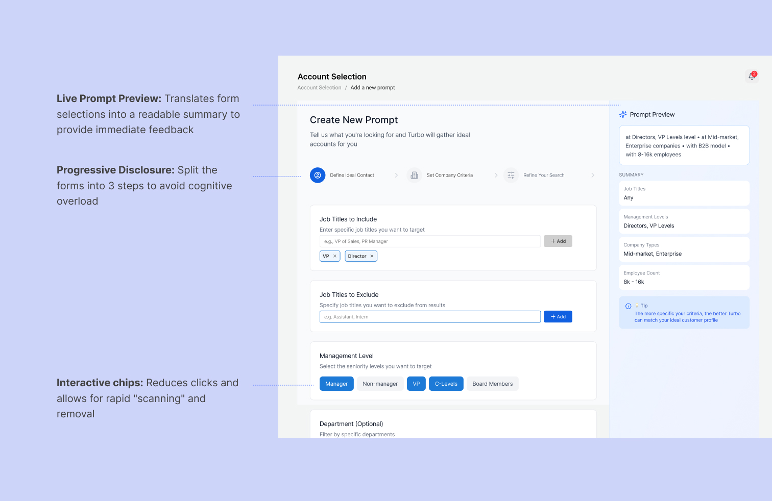
👍 Grouping criteria into distinct cards (Job Titles, Management, Department) reduces cognitive load by allowing users to process one category at a time.
Moving on the the "Account Results", this is where sales reps spend the bulk of their time. My goal was to move from a rigid, spreadsheet-like interface to a dynamic "command center" that prioritizes system-driven intelligence over manual data entry.
Idea 1- Color-coded list and Individual page for account details
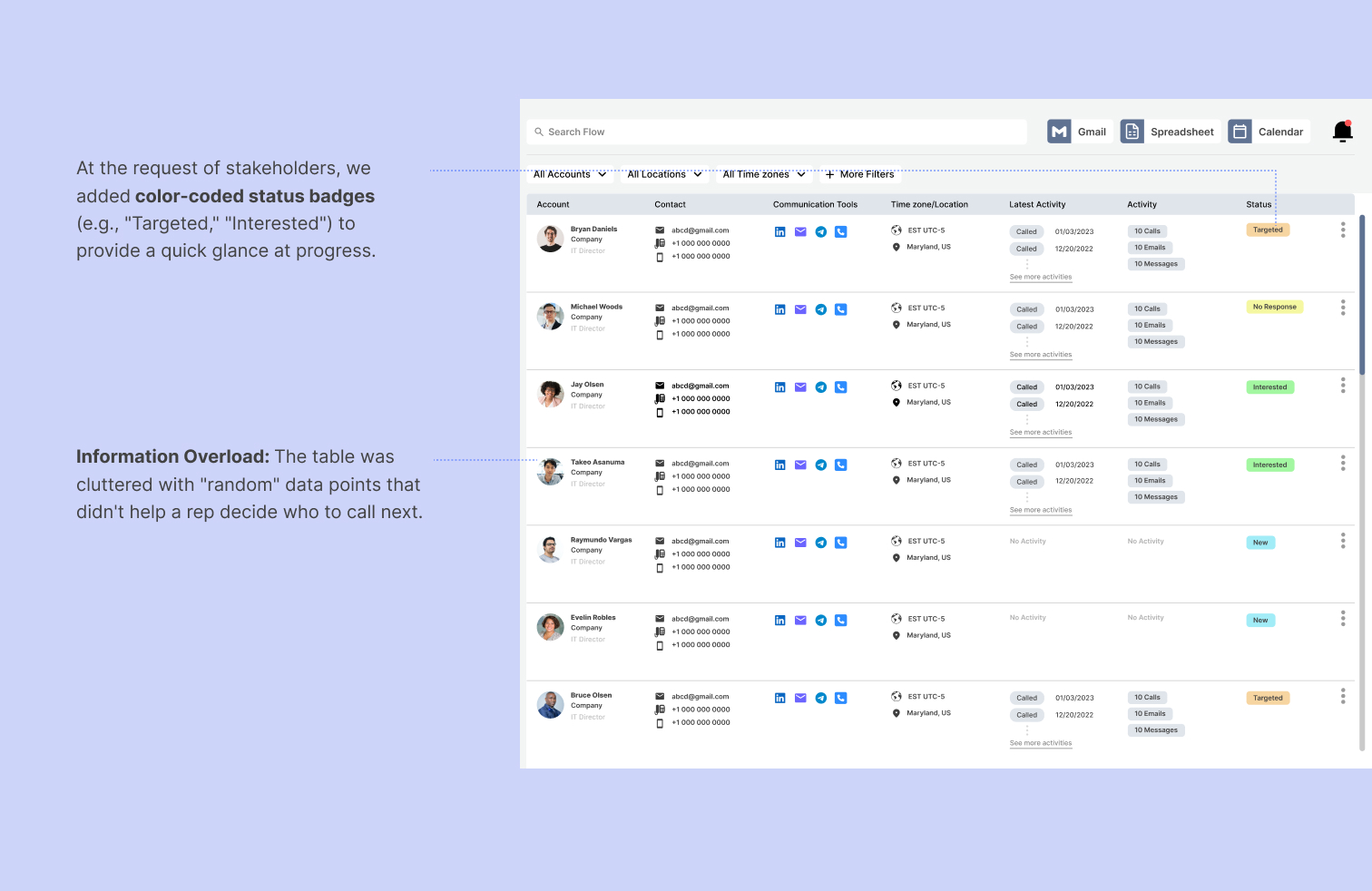

👎 However, user interviews revealed these statuses were often inaccurate because they required manual updates from the rep. Additionally, the individual account page created a "duct-taped" experience where users lost their place in the list every time they needed more information, significantly increasing interaction cost.
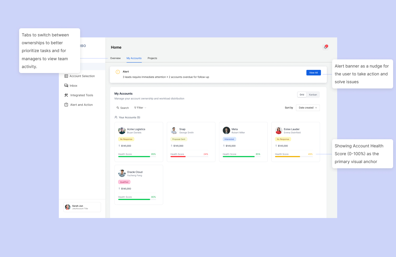
Idea 2- Simplified list with side drawer
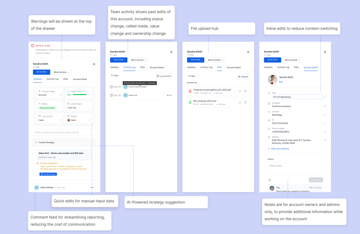
I stripped the table down to only the most crucial activity signals—last contact date, value, and health score. Less critical information was moved into organized tabs within the drawer to reduce cognitive load.


👍 Using a contextual drawer and and a learner information architecture reduced allow users to focus on high-intent signals (e.g., specific communication tools used and latest activity).
Product Walkthrough
Primary Features
Home
Account Detail Side Drawer
Unified Inbox
Alert and Action
Reflection & Impact
Results
We shifted the user experience from "What should I do today?" to "How can I save this account?"
By embedding the Health Score across every touchpoint—from the Project overview to the Alert dashboard—we created a constant feedback loop.
Quantitative Results (from user testing)
- :⏱️ Time saved: 8.5 hours/week on manual status updates (from 3 surveys)
- 📉 Tool switching: Reduced from 6 tools → 2 (Turbo + CRM)
- )📈 Lead response: 40% faster follow-up on at-risk accounts.